
Open Graph Image Size Guide for Every Platform in 2026
Use a practical 2026 sizing strategy for Open Graph images across social feeds, professional networks, and messaging previews.
You will learn
- Choose one sensible master canvas for most link previews
- Design a safe area that survives resizing and modest cropping
- Know when a separate asset is worth the extra maintenance
The direct answer
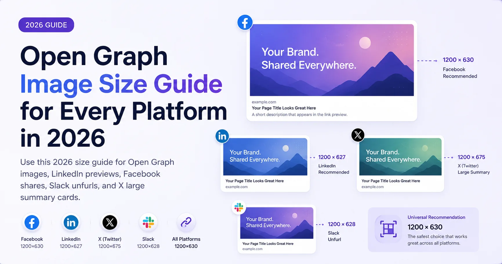
Use a 1200 by 630 image as a practical default, keep important content in a centered safe area, and test the final URL because platforms can crop and render previews differently.
The best general default
A 1200 by 630 canvas remains a useful general-purpose starting point in 2026. Its ratio is close to 1.91:1, which fits common large link-card shapes, and its resolution gives platforms room to reduce the image for smaller previews.
LinkedIn currently documents 1200 by 627 as the minimum for its sharing module and recommends a 1.91:1 ratio. A 1200 by 630 image differs by only a few pixels and is easier for teams to standardize across a broader workflow.
Use one master image for most platforms
Facebook-style feeds, LinkedIn shares, X large-image cards, Slack unfurls, Discord embeds, and messaging apps can all consume Open Graph-style metadata, but they do not render it identically. Maintaining a unique asset for every destination usually creates more work than value.
- Use the 1200 by 630 master image for the page Open Graph metadata.
- Add X card metadata when you need explicit X titles, descriptions, or images.
- Create a platform-specific asset only when a critical campaign layout genuinely needs it.
- Re-test important platforms after a major template or metadata change.
Build a forgiving safe area
Keep the headline, logo, and main subject away from the outer edge. Some clients crop slightly, place interface elements near corners, or show the image in a smaller frame than expected. A centered composition is more resilient than a layout that depends on exact edge alignment.
Safe-area review
- Leave roughly 60 pixels or more around essential content on a 1200 by 630 canvas.
- Keep text concise and use enough contrast to remain legible after reduction.
- Do not rely on a thin border to define the image edge.
- Check the design at 600 by 315 and at a much smaller message-preview size.
- Make sure the visual still explains the topic when the description is hidden.
Know when another shape is justified
One-off campaign need
A separate crop may help
A paid placement, platform-native post, or tightly art-directed launch can justify a dedicated square or vertical creative.
Normal website sharing
One master is easier to govern
A stable landscape asset keeps page metadata, generation, validation, and updates consistent across many URLs.
Do not confuse link-preview images with images uploaded directly into a social post or advertisement. Those publishing surfaces may support different shapes and specifications. This guide focuses on images discovered from webpage metadata.
Test the real page, not a blank canvas
The image can have perfect dimensions and still fail because the page points to an old URL, serves metadata only in the browser, blocks a crawler, or returns an unexpected response. Validate the deployed page, then use the platform-specific inspector for any destination that is business critical.
Check the image your page exposes
Review the dimensions and crawler-facing metadata of a live page before it reaches a social feed.
Preview a page URL